'The first requirement of The Economist is that it should be readily understandable. Clarity of writing usually follows clarity of thought.' - The Economist style Guide.
I'm all in with styled-components and couldn't be happier, it just makes the developer experience much better.
At work we are trilingual so a good developer experience equals natural read/write operations on files.
With Styled-components in play we start our projects with bootstrap.js, a single file that looks painfully empty. 2 Lo-Fi components to rule your world.
export const Paragraph = styled.p.attrs({
  color: props => props.tint || "#444"
  })`
  color: ${props => props.tint};
  font-weight: ${props => (props.bold ? "bold" : "normal")};
  text-transform: ${props => (props.uppercase ? "uppercase" : "none")};
  ${props => props.vertical && css`writing-mode: vertical-lr;`};
  ${props =>
    props.elipsis && css`
      max-width: 100%;
      overflow: hidden !important;
      text-overflow: ellipsis !important;
      white-space: nowrap !important;
      word-wrap: normal !important;
    `};
`;

export const Word = Paragraph.withComponent("span");

const fadeIn = keyframes`
    0% {
    opacity: 0;
    }
    100% {
    opacity: 1;
    }
`;

export const Touchable = styled.button`
  animation: 1s ${fadeIn} ease-out;
  cursor: pointer;
  touch-action: manipulation;
  appearance: none;
  background-color: #ddd;
  padding: 0.5rem 1rem;
  border: none;
  font-size: 1rem;

  & > * {
    pointer-events: none;
  }
`;

export const Link = Touchable.withComponent("a");
export const LinkUnderline = Link.extend`text-decoration: underline;`;
Styled-components' withComponent allows choosing the right tag for the job. Color variations on buttons and force links to appear like buttons is one of the oldest fights. Now we can win it swiftly.
Extend is all you'll ever need to make contextual changes without adding specificity by creating #id > descendant relationships on a CSS file again.
import {
    Paragraph,
    Word,
    Touchable,
    Link,
    LinkUnderline
  } from "../widgets/bootstrap";

export default () => (
  <div>

    <Paragraph uppercase bold tint="red">
      Hello World
    </Paragraph>

    <Touchable
    onClick={e => console.log(e)}>
      Normal Touchable
    </Touchable>

    <Link href="/">
      Normal Link
    </Link>

    <LinkUnderline href="/">
      Link with Underline
    </LinkUnderline>

    <TouchableDelete>
    <Word tint="#999" uppercase bold> Delete </Word> now
    </TouchableDelete>

  </div>
)
const TouchableDelete = Touchable.extend`
  color: #fff;
  background: red;
  &:hover {
    opacity: 0.8;
  }
`;
If a particular view needs some custom styles you can extend one of the Lo-Fi components from bootstrap.js. Magic.
As now we are in control of context, read/write operations, be it styling changes or maintenance, are a source of joy, not pain.
Let's get intimate and build a user widget like those you can find on games without touching a CSS file.
  import { Paragraph } from "../widgets/bootstrap";

export default () => (
  <div>

    <div>
      <SomeContent/>
      <SomeContent/>
    </div>

      <UserCard>
          <Icon viewBox="0 0 16 16">
            <path d="M3 1.5 L3 14.5 L14.258330249197702 8 z" />
          </Icon>
          <UserLevel> 10 </UserLevel>
          <UserName elipsis> James Bond </UserName>
      </UserCard>

    <div>
      <SomeContent/>
      <SomeContent/>
    </div>

  </div>
)
const UserCard = styled.div`
    display: flex;
    align-items: center;
    padding: 5px 10px;
    background: papayawhip;
    color: palevioletred;
    width: 20vw;
    height: 200px;
    margin: 2rem auto;
`;

const Icon = styled.svg`
  transition: fill 0.25s;
  width: 48px;
  height: 48px;
  transform: rotate(90deg);
  ${UserCard}:hover & {
    fill: rebeccapurple;
  }
`;

const UserLevel = Paragraph.extend`
  font-size: 1.6rem;
  flex-grow: 0;
  margin-left: 1rem;
  margin-right: 1rem;
`;

const UserName = Paragraph.extend`
  font-size: 0.9rem;
  flex-grow: 1;
`;
It reads like a poem and it does not need much from the outside world, it's a self explanatory file.
As you contemplate the Way let's consider a classic piece of UI and marvel ourselves on how close to real CSS styled-components feels right now. Most of it works, no need to ditch fav old tricks like :not(:last-of-type).
export default () => (
  <div>

    <PopUp>
      <div>
        <SomeContent/>
      </div>
      <div>
        <SomeContent/>
      </div>
      <div>
        <SomeContent/>
      </div>
    </PopUp>

  </div>
)
const foo = '.4rem';

const PopUp = styled.div`
  border-radius:${foo};
  background: ${props => props.dark ? '#444' : '#f9f9f9'};
  color: ${props => props.dark ? '#f9f9f9' : '#444'};

  @media (min-aspect-ratio: 16/9) {
    position:absolute;
    top:50%;
    left:50%;
    transform:translate(-50%,-50%);
  }

  > div:not(:last-of-type) {
    margin-bottom:1rem;
  }

  #crash & {
    display: none;
  }

  ${props =>
    props.disabled &&
    css`
      background-color: #777;
    `};
`;
All the powers right here right now. Nice.
Let's build a quick video player. At the end we'll have a good-looking code file.
import React, { Component } from "react";
import PropTypes from 'prop-types';
import styled, { css,keyframes } from 'styled-components';
import { Touchable } from "../widgets/bootstrap";

class Video extends Component {
  state = {
    playing: false,
    muted: false
  };

  play() {
    this.el.play();
    this.setState({ playing: true });
  }

  stop() {
    this.el.pause();
    this.setState({ playing: false });
  }

  mute() {
    this.el.muted = true;
    this.setState({ muted: true });
  }

  unmute() {
    this.el.muted = false;
    this.setState({ muted: false });
  }

  render() {
    const { src, poster } = this.props;

    return (
      <VideoCtn>

        <Video
          poster={`../media/posters/${poster}.jpg`}
          ref={el => {
            this.el = el;
          }}>
          <source src={`../media/${src}.webm`} type="video/webm" />
          <source src={`../media/${src}.mp4`} type="video/mp4" />
          <source src={`../media/${src}.ogg`} type="video/ogg"/>
        </Video>

        <VideoCtrls>
          <div>
            {!this.state.playing
              ? <Touchable onClick={() => this.play()}>
                    <i className="icon ion-ios-play" />
                </Touchable>
              : <Touchable onClick={() => this.stop()}>
                    <i className="icon ion-ios-pause" />
                  </Touchable>
                }
          </div>
          <div>
            {!this.state.muted
              ? <Touchable onClick={() => this.mute()}>
                  <i className="icon ion-android-volume-off"/>
                </Touchable>
              : <Touchable onClick={() => this.unmute()}>
                  <i className="icon ion-android-volume-up"/>
                </Touchable>
              }
          </div>
        </VideoCtrls>

      </VideoCtn>
    );
  }
}

export default Video;


const VideoCtn = styled.div`
  position: relative;
  padding-bottom:${props => props.tv ? '75%' : '56.25%'};
  height: 0;
`;

const Video = styled.video`
  position: absolute;
  top: 0;
  left: 0;
  width: 100%;
  height: 100%;
`;

const VideoCtrls = styled.div`
  position: absolute;
  width: 100%;
  left: 0;
  height:2.5rem;
  bottom: -2.5rem;
  z-index: 10;
  display:flex;
  justify-content:space-between;
  align-items:center;
  padding:0 .5rem;
  background-color:#ddd;
`;
One last Real World Example, it's a complex component/piece of UI but it reads like a poem and does not need any 'external' CSS to shine.
At work we've build our own feedback 'tool', when a client fills a bug we ask for a few things, one of them is on which device the err ocurred (think breakpoint, OS/Software has it's own picker).
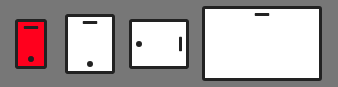
We had little time so we hack the devices with CSS (I now know better than to lose myself browsing The Noun Project).
class CreateBug extends Component {
  state = {
    device: "phone",
  };

  renderDeviceSelector() {
    if (!this.state.device) return;

    return (
      <Devices>
      <Iphone
      pressed={this.state.device == "phone"}
      onClick={() => this.setState({ device: "phone" })}
    />
      <Tablet
      pressed={this.state.device == "tablet"}
      onClick={() => this.setState({ device: "tablet" })}
    />
      <Tablet
      pressed={this.state.device == "tablet-landscape"}
      onClick={() => this.setState({ device: "tablet-landscape" })}
      landscape
    />
      <Desktop
      pressed={this.state.device == "desktop"}
      onClick={() => this.setState({ device: "desktop" })}
    />
  </Devices>
      )

  }

  render() {

    return (
      <Editor>
       {this.renderDeviceSelector()}
      </Editor>
    )
  }
}


const Devices = styled.div`
  display: flex;
  flex-direction: row;
  justify-content: space-between;
  align-items: center;
  padding: 1rem;
`;

const Mobile = styled.span`
  &:before,
  &:after {
    content: "";
    position: absolute;
  }

  &:before {
    width: 15px;
    height: 3px;
    left: 50%;
    top: 4px;
    transform: translateX(-50%);
    border-radius: 15px;
    background: #222;
    background-clip: padding-box;
  }

  &:after {
    width: 6px;
    height: 6px;
    left: 50%;
    bottom: 4px;
    transform: translateX(-50%);
    border-radius: 50%;
    background: #222;
    background-clip: padding-box;
  }
`;

const Iphone = Mobile.extend`
  position: relative;
  width: 32px;
  height: 50px;
  border: 3px solid #222;
  border-radius: 3px;
  background-color: #fff;
  background-clip: padding-box;

  ${props => props.pressed && css`background-color: red;`};
  `;

const Tablet = Mobile.extend`
  position: relative;
  width: 50px;
  height: 60px;
  border: 3px solid #222;
  border-radius: 3px;
  background-color: #fff;
  background-clip: padding-box;

  ${props => props.pressed && css`background-color: red;`};
  ${props => props.landscape && css`transform: rotate(90deg);`}
`;

const Desktop = styled.span`
  position: relative;
  width: 120px;
  height: 75px;
  border: 3px solid #222;
  border-radius: 3px;
  background-color: #fff;
  background-clip: padding-box;

  &:before,
  &:after {
    content: "";
    position: absolute;
  }

  &:before {
    width: 15px;
    height: 3px;
    left: 50%;
    top: 4px;
    transform: translateX(-50%);
    border-radius: 15px;
    background: #222;
    background-clip: padding-box;
  }

  &:after {
    display: none;
  }

  ${props => props.pressed && css`background-color: red;`};
`;
You could atomize things more and make renderDeviceSelector a component with it's own file, do what you feel is best, find your balance. In my experience, the bigger the project, the more I hate naming files, importing them, switching folders...mental debt for the future self.
With Styled-components I can write better 'files', easier on the eyes of my teammates and future self.
(What I'm trying to say is find your way and don't settle with your current flow just yet)